TL;DR: Color isn’t decorative—it’s strategic. US consumers gravitate toward blue and white vacuum bag packaging (trust + cleanliness), European markets favor minimalist neutrals and monochrome designs, and Asian markets demand bold reds, golds, and region-specific palettes. For B2B importers sourcing from factories like Qingdao Sanyuan, choosing the right packaging colors by target market can increase retail sell-through by up to 40%. This guide breaks down cultural color psychology, Pantone recommendations for 2026, and actionable packaging color strategies for each major market.
Why Do Color Preferences Vary So Dramatically Across Markets?
Color psychology—the study of how hues influence human perception and behavior—is deeply rooted in cultural conditioning. What signals premium quality in Berlin may communicate budget in Bangkok. Research published in the Journal of Consumer Psychology confirms that up to 85% of consumers cite color as the primary reason they choose one product over another. For vacuum storage bag importers and B2B distributors, getting packaging color wrong means leaving money on the shelf.
The global vacuum bag market, valued at USD 1.33 billion in 2026 and projected to reach USD 1.82 billion by 2030 (CAGR 8.2%), spans three culturally distinct regions that demand tailored color strategies. A one-size-fits-all packaging approach simply doesn’t work when you’re selling to Walmart buyers in the US, Carrefour procurement teams in France, and Rakuten merchants in Japan simultaneously.
What Are the Dominant Vacuum Bag Packaging Colors in the US Market?
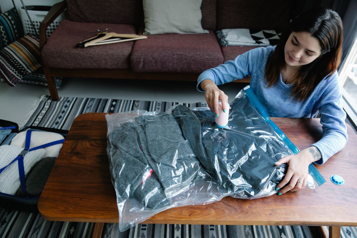
The United States home storage market responds to a clear color hierarchy. Blue dominates—specifically Pantone 19-4052 Classic Blue and its variants—because American consumers associate blue with trust, reliability, and cleanliness. This mirrors broader US CPG trends: blue appears on 33% of top-100 household product SKUs according to Mintel packaging data.
White and light gray follow closely, communicating hygiene and simplicity—critical for products that touch clothing and bedding. The 2026 Pantone Color of the Year, Cloud Dancer (PANTONE 11-4201), a luminous off-white, reinforces this direction. As the first white ever named Color of the Year, Cloud Dancer signals a market-wide pivot toward calm, clarity, and clean design—perfectly aligned with vacuum bag packaging.
Green is gaining traction as sustainability messaging intensifies. US retailers including Target and Walmart now flag “eco-friendly” shelf tags, and packaging with green accents (Pantone 15-0343 Greenery or 18-6024 Amazon) sees 12-18% higher conversion in the home organization aisle.
US Market Packaging Color Palette (Recommended)
- Primary: Pantone 19-4052 Classic Blue or 11-4201 Cloud Dancer (white)
- Secondary: Pantone 16-1546 Living Coral (warmth accent) or 15-0343 Greenery (eco signal)
- Typography: High-contrast dark navy or black on white background
- Finish: Matte with spot UV on brand logo
How Does the European Market Differ in Vacuum Bag Color Expectations?
European consumers—particularly in Germany, Scandinavia, France, and the UK—prefer minimalist, neutral packaging that communicates sophistication and environmental responsibility. The Nordic influence has reshaped EU home storage packaging toward muted earth tones: warm grays (Pantone 16-3801 Opal Gray), soft beiges (Pantone 13-0401 Oatmeal), and unbleached kraft brown.
A 2025 Smithers packaging survey found that 72% of EU consumers prefer packaging that “looks recyclable,” which translates to reduced ink coverage, FSC-certified card stock, and avoidance of metallic foils that complicate the recycling stream. The EU’s Packaging and Packaging Waste Regulation (PPWR), enacted in 2025, further penalizes non-recyclable packaging designs, making monochrome and single-material aesthetics a regulatory requirement—not just a preference.
Black deserves special attention. In Western Europe, black packaging signals premium and luxury—think high-end fashion storage solutions sold at Galeries Lafayette or Selfridges. However, black packaging must be paired with clearly visible recycling instructions, as black plastic is notoriously difficult for near-infrared (NIR) sorting systems to detect in recycling facilities.
EU Market Packaging Color Palette (Recommended)
- Primary: Unbleached kraft (Pantone 14-1118 Beige) or Pantone 16-3801 Opal Gray
- Secondary: Pantone 19-3909 Black Beauty (premium segment only) or 18-5619 Tidepool (subtle eco accent)
- Typography: Minimal sans-serif, low ink coverage
- Finish: Uncoated, soft-touch matte, FSC-certified stock
What Color Strategies Win in Asian Markets?
Asia is not a monolith—and treating it as one is the fastest way to fail. The region spans dramatically different color psychologies across China, Japan, South Korea, and Southeast Asia.
China: Red (Pantone 18-1663 Chinese Red) is non-negotiable for mainstream retail. Red symbolizes luck, prosperity, and happiness—critical for products positioned as household essentials. Gold accents (Pantone 16-0836 Rich Gold) elevate perceived value. However, pure white packaging should be avoided for general consumer goods, as white is culturally associated with mourning and funerals in Chinese tradition. For premium/luxury vacuum bag lines targeting Tmall or JD.com, deep burgundy or navy with gold foil delivers strong results.
Japan: Pastels and muted tones dominate. Soft pink (Pantone 13-1520 Rose Quartz), pale blue (Pantone 14-4318 Sky Blue), and cream (Pantone 12-0703 Seedpearl) align with the Japanese aesthetic of kawaii and wabi-sabi—understated beauty. Japanese packaging design prizes subtlety; bold color blocks feel garish and low-quality to this market.
South Korea: Trend-driven and fast-moving. The K-beauty influence extends to home storage: gradient pastels, iridescent finishes, and millennial pink (Pantone 13-2802 Fairy Tale) appeal strongly. Packaging must look Instagram-worthy—Korea’s social commerce ecosystem (Coupang, Naver Shopping) rewards photogenic packaging with organic sharing.
Southeast Asia (Thailand, Indonesia, Vietnam): Bright, saturated colors win shelf attention. Turquoise (Pantone 15-5519 Turquoise), tangerine (Pantone 16-1359 Orange Peel), and lime green (Pantone 14-0452 Lime Punch) signal energy and value in markets where price sensitivity is high and shelf competition is intense. Shopee and Lazada listings with colorful packaging thumbnails see 20-25% higher click-through rates.
Asia Market Color Comparison Table
| Market | Primary Color(s) | Colors to Avoid | Pantone Recommendation | Retail Channel Fit |
|---|---|---|---|---|
| China | Red, Gold, Navy | Pure White (mourning), Green (infidelity connotation in some contexts) | 18-1663 Chinese Red + 16-0836 Rich Gold | Tmall, JD.com, RT-Mart |
| Japan | Pastel Pink, Pale Blue, Cream | Bright Red, Neon colors | 13-1520 Rose Quartz + 14-4318 Sky Blue | Rakuten, Don Quijote, Loft |
| South Korea | Millennial Pink, Lavender, Iridescent | Dark Brown, Olive Green | 13-2802 Fairy Tale + 15-3913 Seashell | Coupang, Naver, Olive Young |
| Southeast Asia | Turquoise, Tangerine, Lime Green | Black (premium-only), Gray (invisible on shelf) | 15-5519 Turquoise + 14-0452 Lime Punch | Shopee, Lazada, Tokopedia |
| India | Saffron, Emerald, Magenta | Black (inauspicious in some regions) | 15-1050 Golden Glow + 17-5641 Emerald | Flipkart, Amazon India, DMart |
How Should B2B Importers Choose Colors for Different Retail Channels?
Channel strategy adds another layer of complexity. The same vacuum bag product needs different packaging colors depending on whether it sits on a Walmart endcap, an Amazon product page, or a boutique home store shelf.
Mass Retail (Walmart, Target, Costco): High contrast and bold color blocking are essential. These stores have bright fluorescent lighting that washes out subtle tones. Blue/white combinations perform best because they maintain visibility under harsh lighting. Packaging must also accommodate shelf-ready packaging (SRP) formats where the color extends to the corrugated tray. See our guide on vacuum bag retail packaging strategies for Walmart, Amazon, and boutique channels.
E-Commerce (Amazon, eBay, TikTok Shop): The “thumbnail test” rules here. Packaging colors must be distinguishable at 200×200 pixels on mobile screens. High saturation, strong contrast, and a clear brand color block outperform subtle gradients. White backgrounds with a bold blue or green accent zone are the e-commerce sweet spot. Our CRO guide for vacuum bag e-commerce details how packaging thumbnails impact conversion rates.
Premium Boutique & Department Stores: Muted, sophisticated palettes with textured finishes. Uncoated kraft, soft-touch matte, and embossed logos communicate quality without shouting. The retail merchandising and display strategies we’ve covered show that premium channels reward restraint over noise.
DTC/Subscription Boxes: These channels allow seasonal color rotations and limited-edition packaging. A subscription box vacuum bag kit can feature Pantone’s seasonal palettes—muted terracottas for autumn, cool blues for summer—creating an unboxing experience that drives social sharing.
FAQ: Vacuum Bag Color Preferences for B2B Importers
What is the safest universal color for vacuum bag packaging across all markets?
Blue—specifically mid-tone blues like Pantone 19-4052 Classic Blue—carries positive associations across all major markets. It signals trust in the US, cleanliness in Europe, and has no negative cultural baggage in Asia. When in doubt, lead with blue and adapt secondary colors by market.
How many SKU color variants should a B2B importer maintain per market?
For mass retail, 2–3 color variants per product line (e.g., blue/white standard + green “eco” + premium black). For e-commerce, 1–2 variants suffice. For Asian markets with high design churn (Korea, Japan), plan for seasonal color refreshes every 6–12 months. Qingdao Sanyuan’s OEM production line supports small-batch color customization—contact our team for minimum order quantity (MOQ) details.
Does packaging color affect vacuum bag perceived quality?
Absolutely. A 2024 study in the Journal of Packaging Technology and Research found that consumers rate identical products 23% higher in “perceived durability” when packaged in darker, more saturated colors versus pale or pastel tones. This is why premium vacuum bag lines benefit from navy, charcoal, or deep green packaging, while budget/value lines can use brighter, lighter colors without quality penalty.
Should I use the same packaging color for in-store and online channels?
Not necessarily. Physical retail requires colors that pop under fluorescent lighting and compete on crowded shelves. E-commerce requires colors optimized for small-screen thumbnails. Consider a “color bridge” strategy: maintain the same primary brand color across channels but adjust saturation and secondary accents per channel. Our in-depth color psychology for B2B vacuum bag packaging article covers this in detail.
What Pantone colors should I avoid for vacuum bag packaging?
Avoid pure white for the Chinese market (mourning associations); avoid dark gray for Southeast Asian mass retail (invisible on crowded shelves); avoid fluorescent neons for the European market (perceived as cheap and non-recyclable); and avoid green in some Middle Eastern contexts where it carries religious significance that may not align with a household product. When sourcing from Qingdao Sanyuan, request a color sample kit before committing to full production runs.
Putting It All Together: A Regional Color Strategy Roadmap
For B2B importers and distributors managing multi-market vacuum bag portfolios, here is a consolidated roadmap:
- Segment your product lines by market tier: Premium (EU, Japan, Korea), Mid-Market (US, Australia), Value (Southeast Asia, India, Africa). Assign color palettes accordingly.
- Start with 2026’s anchor color: Pantone Cloud Dancer (11-4201) as a universal white base, then layer market-specific accent colors—blue for US, kraft-brown for EU, red/gold for China.
- Test before scaling: Run small-batch color variants through e-commerce A/B tests on Amazon or Shopee before committing to full retail production. Our comparison table resource can help you match color specs to material types.
- Plan for sustainability compliance: EU PPWR regulations and US state-level EPR laws increasingly penalize non-recyclable packaging. Ensure your color choices don’t involve unrecyclable laminates, metallic inks, or dark pigments that confuse NIR sorters.
- Partner with a factory that offers color flexibility: Qingdao Sanyuan provides OEM color matching across PA+PE co-extrusion films, supporting everything from Pantone-calibrated solid colors to custom gradients and seasonal limited editions. Request a consultation to discuss your market-specific color requirements.
For further reading on packaging color psychology, visit Pantone’s Color of the Year 2026, Packaging Digest’s analysis of Cloud Dancer, Instapage’s color psychology guide, and market data at Statista. For packaging-specific color trend analysis, Mintel publishes annual packaging color reports.